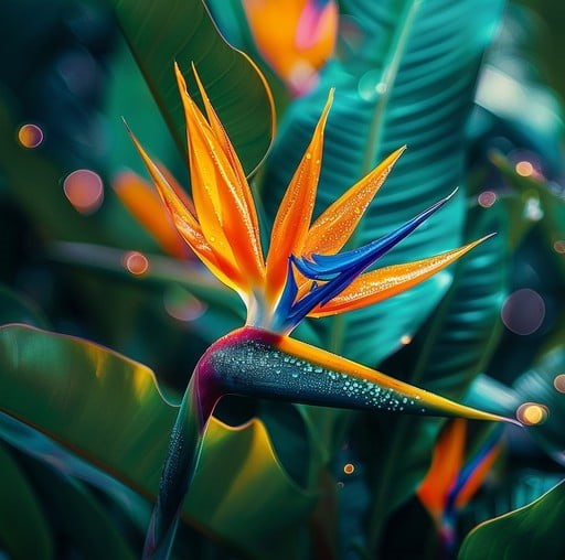
When I first stumbled upon the Bird of Paradise flower in a garden years ago, its vibrant orange and electric blue petals struck me like a burst of sunshine and ocean spray all at once. Since then, I’ve been obsessed with translating that impossible energy into design projects — whether it’s refreshing a room, crafting a brand identity, or even sewing a statement piece.
The Bird of Paradise isn’t just a tropical flower; it’s a mood, a vibe, a little slice of paradise that’s surprisingly versatile.
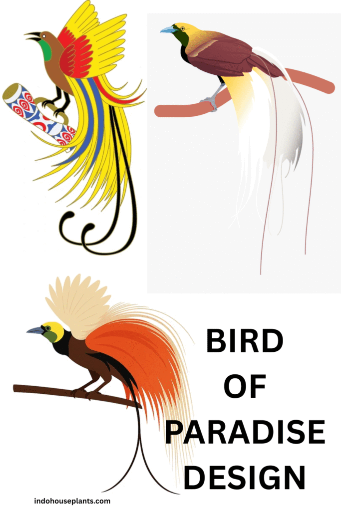
What Makes Bird of Paradise Design So Magnetic?
Here’s the secret: it’s not just the bright colors or the exotic shape. It’s the story that comes with it — a symbol of freedom, adventure, and natural flair that resonates deeply. The flower’s structure reminds me of a bird mid-flight, a frozen moment of dynamic energy. That’s why designers and creatives fall in love with it.
Bird of Paradise design works because it boldly contrasts structure and wildness. The flower’s sharp, angular petals play beautifully against the soft curves of tropical foliage, offering tension that’s visually exciting. This duality lets you take the design in many directions—whether it’s sleek and contemporary or lushly vintage.
How I Approach Bird of Paradise Design (and What Most People Don’t Know)
- Start with a Story, Not Just Colors: Instead of jumping straight to orange and blue, I think about what Bird of Paradise means in the space or the brand. For example, when designing a tropical-themed café, I imagined how the flower might symbolize the energetic burst a fresh juice gives you. This storytelling angle helped me create a logo where petals doubled as fruit slices—unexpected, yet absolutely on point.
- Play with Scale and Focus: One trick I rarely see talked about is mixing large-scale motifs with tiny hints of the flower—like a wallpaper pattern with oversized blooms paired with cushions featuring delicate, minimalist outlines. This layering adds depth and keeps the look from feeling too “theme park” kitsch.
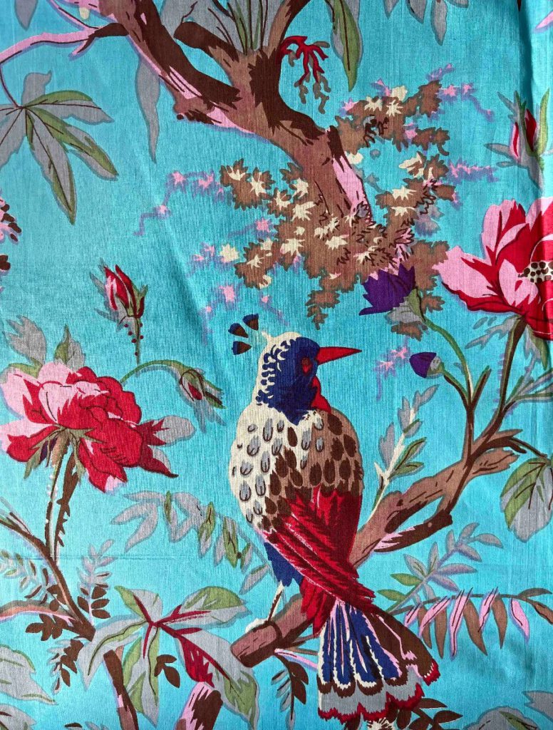
- Experiment with Texture and Materials: I once worked on an upholstery project with Bird of Paradise fabric. Instead of flat cotton, we used a velvet blend to mimic the flower’s velvety petals, adding tactile richness. Pairing this with natural wood textures and rattan furniture brought a grounded warmth that balanced the intense print perfectly.
Real-Life Examples That Stuck with Me
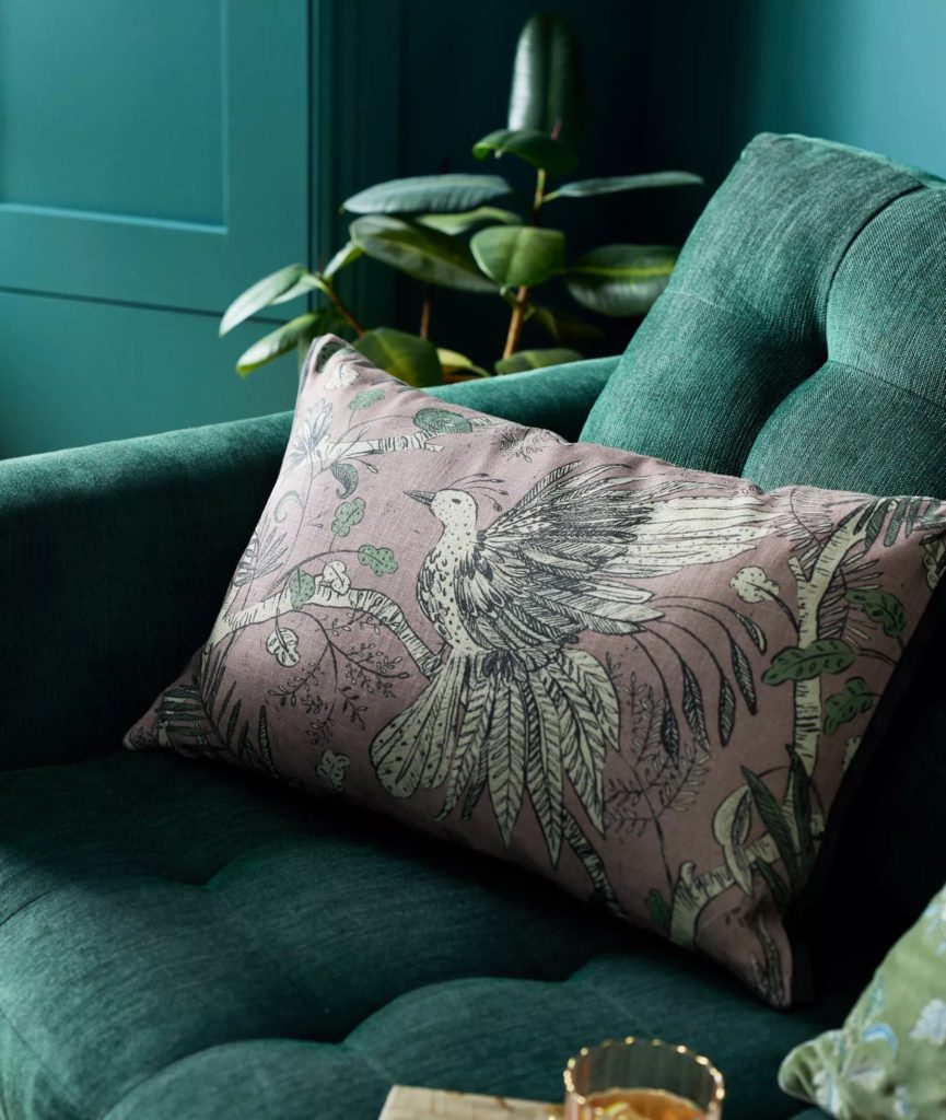
- In a Friend’s Living Room: She chose a statement wallpaper with huge Bird of Paradise flowers in saturated colors. The secret to its success? The room was painted in a soft, muted teal that echoed the flower’s leaves but didn’t compete. Plus, wooden accents and natural linen curtains softened the look, turning what could’ve been an overwhelming pattern into a chic, livable retreat.
- A Small Boutique’s Branding: The owner wanted a logo that felt fresh and tropical but also modern. I suggested we abstract the flower’s shape into a simple icon—angular shapes that hinted at the flower without being literal. The client loved it because it felt unique and scalable across signage, packaging, and social media.
- Fashion Design: One designer I worked with created a flowing dress where the Bird of Paradise print was concentrated near the hem, fading upward into solid color. It gave the garment movement and visual interest without being overpowering—a perfect balance of bold and wearable.
Navigating Common Pitfalls Like a Pro
- Too Bold, Too Fast? If you’re freaked out by that electric orange, I get it. My advice: use the flower’s palette in subtle accents first—a throw pillow here, a lampshade there. It’s easier to build your confidence and style language that way rather than diving into an entire room or outfit.
- Mixing Patterns Without Chaos: Clashing prints are the fastest way to lose the magic. The trick I swear by is limiting yourself to one bold floral plus one simple pattern like stripes or a tonal weave. For example, a Bird of Paradise cushion paired with a dark green velvet sofa is like peanut butter and jelly—flavorful, balanced, and just right.
- Avoiding the “Tiki Bar” Trap: I’ve seen Bird of Paradise design veer into cliché tiki bar territory when paired poorly with too many neon colors or plastic décor. Ground your design in natural materials and thoughtful color choices to keep it fresh and authentic.
Your Next Move (Trust Me, It’s Worth It)
- Browse online marketplaces like Etsy for Bird of Paradise prints that resonate with you. When you see something that stops you, pause—there’s your instinct guiding you.
- Start small but meaningful: maybe a framed print, a patterned tea towel, or even a statement earring. I still keep a Bird of Paradise enamel pin from a trip, and it never fails to spark compliments and conversations.
- If you’re crafting a design from scratch, sketch the flower with no pressure for perfection. I like to simplify its form into blocky shapes and vibrant swaths of color, capturing the spirit rather than exact detail.
- Experiment with pairing: try out that tropical throw pillow on your neutral couch or a wall decal with tropical leaves next to a solid color wall. Watch how your space or project transforms.
- Keep a visual folder—Pinterest or your phone’s notes app works great! Save styles that spark joy or make you curious. Over time, you’ll notice your personal Bird of Paradise aesthetic emerging, uniquely yours.
Why I Keep Coming Back to Bird of Paradise Design
It’s that rare theme that’s instantly recognizable but endlessly adaptable. Whether I’m working on branding, interior design, or fashion, it brings energy without shouting over everything else. It’s familiar but never boring.
Most importantly, it invites you to play — to mix hard lines and lush colors, to balance drama with subtlety, and to inject a bit of tropical joy into everyday life.
If you approach the Bird of Paradise not just as a flower but as an attitude—bold, bright, and adventurous—you’ll find the design process becomes not just enjoyable but genuinely inspiring. Give yourself permission to experiment and embrace the vibrant chaos. That’s where the magic lives.